Show the season. Credit the clothes.
Intro
KOZABURO is the New York label of one designer, Kozaburo Akasaka. Most of his clothes sell through stockists, where a piece gets a photograph and a line of copy. His own site is the one place a season is seen whole, so I designed it around the seasons, not the store, and put the credits on the clothes.
Role / Scope
The home page belongs to the season.
The home page plays the season’s film, not this week’s stock. Every piece in the film is credited, and a credit opens that piece’s page.
In motion · from the home page to a confirmed order
Tradeoff: a home page built around this week’s stock would get more people into the shop. Here the credits have to carry them there, so where orders start is the first thing I’d measure.
The credit goes on the photograph.
Each look is one photograph with its pieces marked on it and credited by number: name, color, price and sizes, with Add to bag. On the phone the credits take turns, 01 of 02, then Next.
When a piece also appears in the season’s film, its page links to the moment: the tee’s page has Seen in the film at 05:20, with Play from here and View look 8.
In motion · from a look to the film
Look 8, the tee’s page, then Play from here: the frame grows to fill the phone and the film runs from 05:20.
Tradeoff: every look needs its pieces placed on the photograph, one by one. A row of products under the picture would be quicker to build, but the credit belongs on the clothes, where the eye already is.
The shop stays in the season.
Every piece is shown worn, on pale grey and cut at the thigh, so the clothes fill each tile. The season’s film takes one tile on the wall, with what he’s wearing credited underneath.
In motion · the shop wall
Fit first.
Pieces can’t be returned or exchanged for size, so the product page has to settle the fit. The Hopsack New Jacket’s page puts a note on how it fits and its measurements above the sizes, and the measurements change with each size you pick.
In motion · sizes and measurements
Black only on the way to paying.
Even Add to bag is an outline. Payment asks the shopper to confirm the measurements before Place order, for the same reason the product page leads with fit.
In motion · from the bag to a confirmed order
The order is confirmed over the season’s film, set out around him the way the home page credits him: the order number, the piece and its size, what was paid, where it ships from and when.
Tradeoff: the measurements checkbox will cost some sales. I’d rather lose the sale than sell a jacket in the wrong size with no way to return it.
A season with a film opens on it.
Past the store, the site belongs to the seasons, and each one arrives as its own world. Fall 2021, Monkwear, came with a film by Yohei Haga, shot at Kongobu-ji on Mount Koya. After the show and a week of sales appointments in Tokyo, Akasaka set aside a week of sales meetings in Kyoto for monks only.
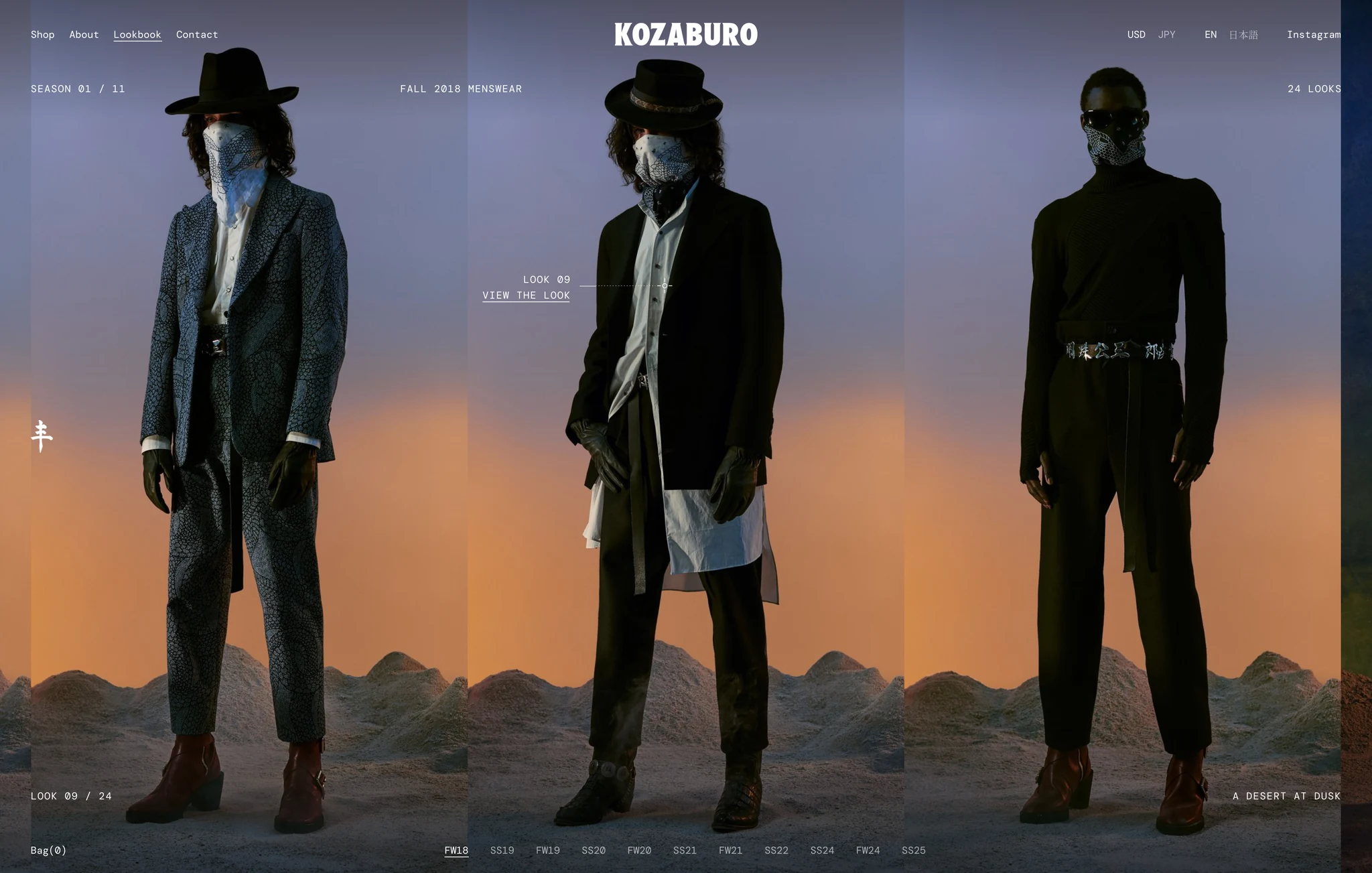
Each season’s facts sit in the same places every time: its number in the archive, the look count, the season and where it was shot or shown. Fall 2018 opens on look 9, in a desert at dusk; the photograph is portrait, so its own sky is extended to the edges rather than cropping the figure. Flipping through the codes is flipping through the films: Monkwear for Fall 2021, Guardians on the subway at night for Spring 2024, Zen Artisan with Perry Yung in Chinatown for Spring 2025.
In motion · flipping through the seasons
In motion · season openers on the phone
The codes along the foot are the archive’s. Tap FW21 and its film plays behind the words. Drag the codes along and tap SS25, and its two looks stand side by side; drag back for FW18.
The credit follows him through every take.
The home page can open on any take of the film: the dancer before the gold screens, the cemetery path at Okunoin, the hoodie in the hall, the veranda, the garden. The season’s words keep to set places around the picture and step aside when someone comes near. On the white veranda the type is drawn in difference, so it reads dark on the light and white over the jacket. The page plays in Japanese or English: the hall here is in Japanese and the veranda in English, and in the opening clip the dancer turns from one to the other.
In motion · two takes, four pieces, two languages
Two takes from Yohei Haga’s film.
Up close, a small ring with four ticks is set on the piece and tracked frame by frame. Its leader is dotted while it crosses him and solid in the open. The credit gives the number and name, then a second line that alternates color and price with the sizes every 2.8 seconds. Pause, and each piece gets a column beside the picture with its sizes and Add to bag.
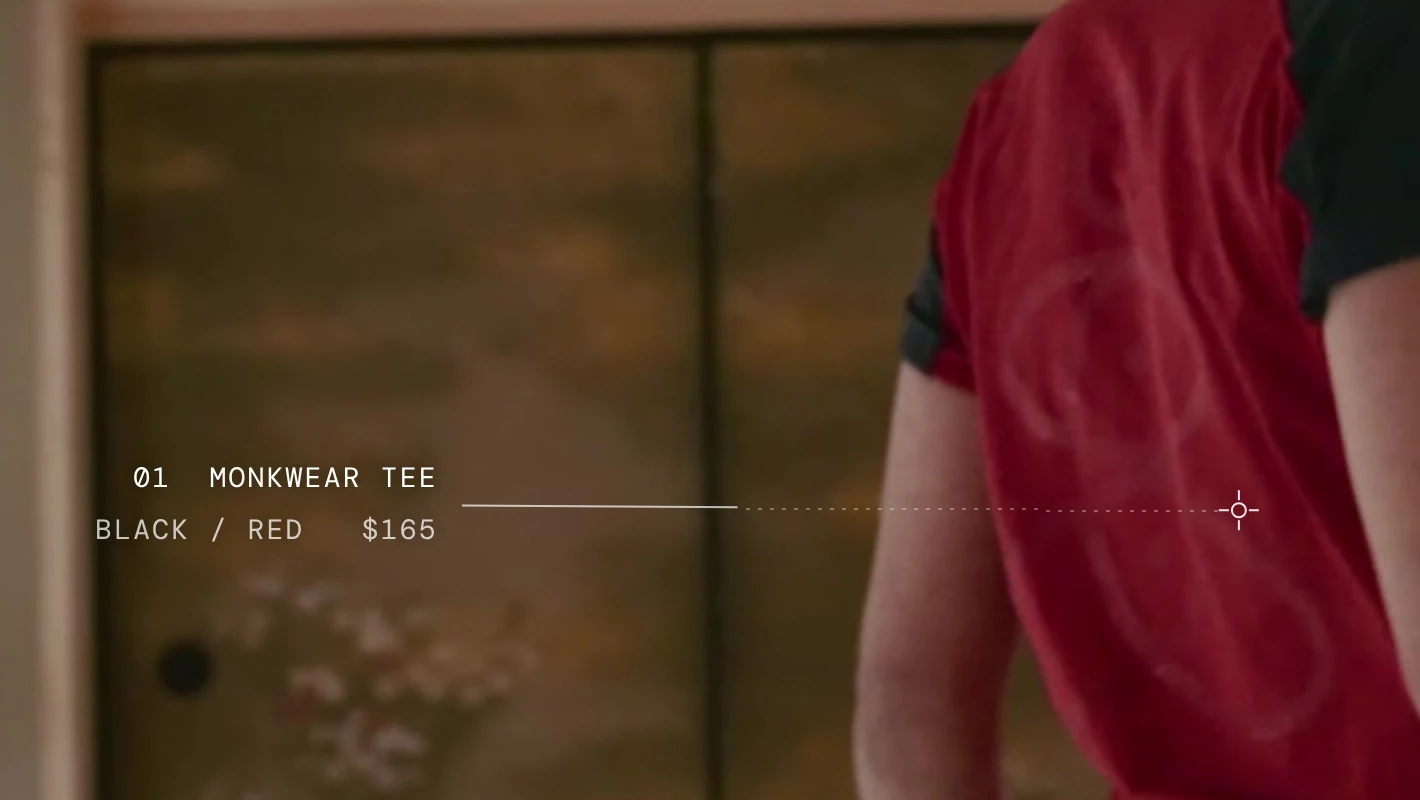
Tradeoff: a credit that rides on the clothes has to be tracked frame by frame, take by take. A fixed caption would be far cheaper, and it would stop pointing at the piece the moment he moved.
Nothing leaves the archive.
The archive is one line of every look, Fall 2018 to Spring 2025, full bleed at full height, with a black slate where each season begins. It runs on the home page’s rules: the words hold their places and step aside, letter by letter, when a figure comes near. The look under the pointer is credited on the figure: piece by piece where its pieces are in the shop, as Fall 2021’s are, and as the look itself where they aren’t. Choosing a code moves the line to that season while the words roll over outward from the code.
In motion · along the line, then to Fall 2021
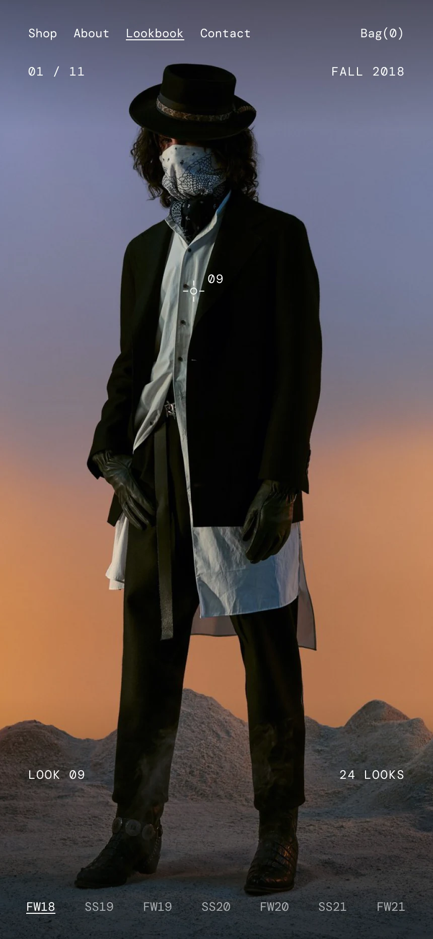
On the phone
The line swipes sideways, one look to the screen. The words get shorter and sit in the corners the figure leaves clear, the look is marked on him, and the codes along the foot drag sideways, as on the openers.
Tradeoff: the archive shows far more than the shop can sell. I kept every season anyway. A stockist takes a piece down when it sells out, and his own site is the one place the whole body of work stays together.
The designer, in his own words.
About puts his two ideas, Brutal sensitivity and Global individualism, on either side of his portrait, each in English over a vertical line of Japanese. Across the jacket runs his line for what the clothes are for: the wardrobe for crossing the bridge between the East and the West.
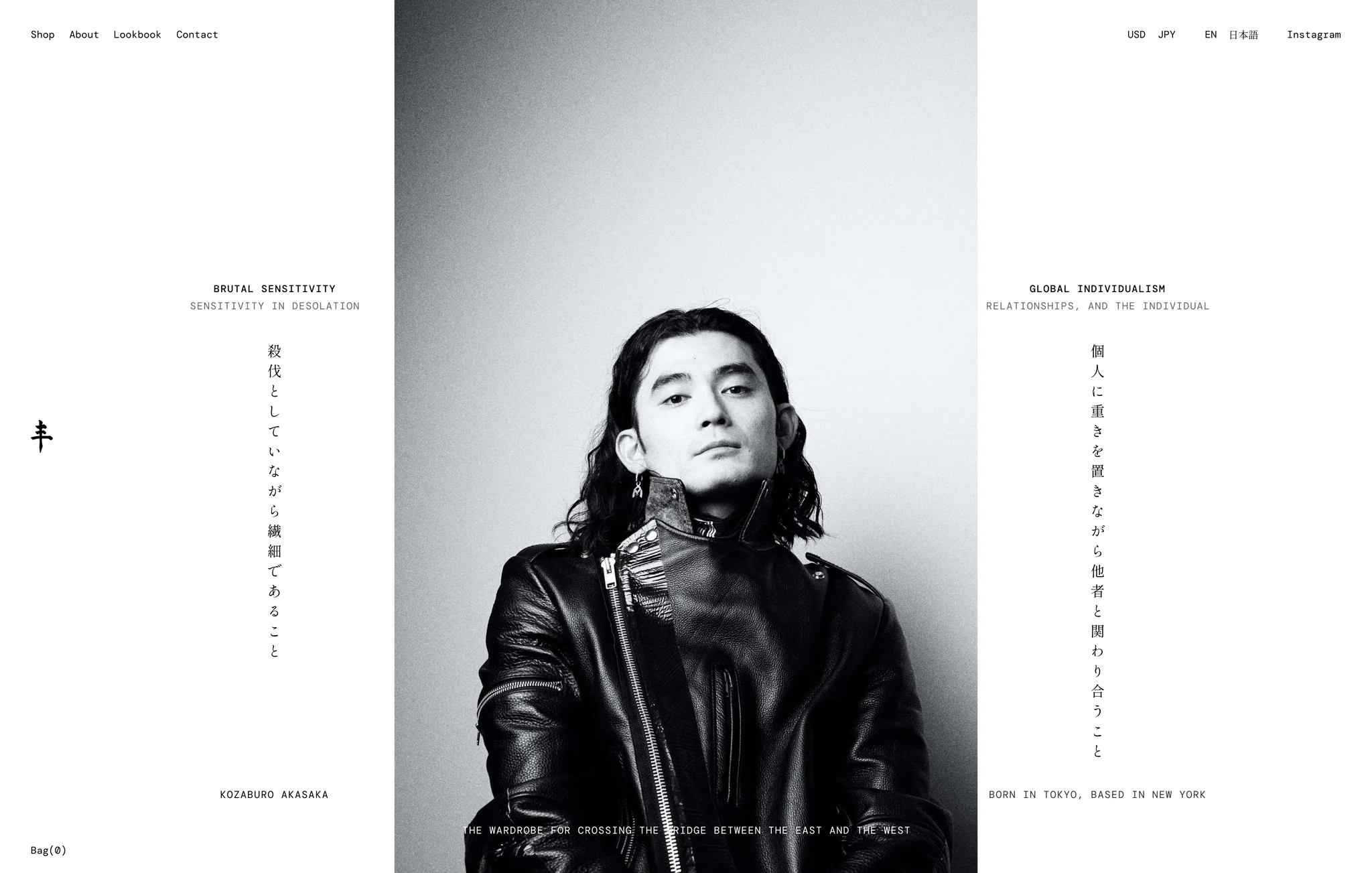
In motion · About on the phone
The two ideas come in at the top, and the Japanese is written down each edge a character at a time. Below his name and his line, his words follow in Japanese, then English.
A few rules carry every page.
| Rule | How it works | Why |
|---|---|---|
| Black means paying | Checkout and Place order are the only black buttons. Every other button, Add to bag included, is an outline. | A shopper never has to read a button to know whether it leads to paying. |
| Cut at the thigh, on grey | Studio shots sit on pale grey, #E0E1DE, cut at the thigh: on the shop wall, on the product page, in the bag and in the order summary. | The clothes fill the frame, with no shoes or floor to compete. |
| Credits point at the piece | In a look or the season’s film, each piece is marked on the picture and credited by number. | The credit stays tied to what it names, not to a list below. |
| One typeface | Every English line is DM Mono, and none of it is set large. The archive’s codes, counts and look numbers are the same size as the nav. | The words read as labels on the photographs, never as headlines over them. |
| Two languages, one layout | Japanese is set in Shippori Mincho, one size up from DM Mono, along with any English quoted inside it. Everywhere else, Latin letters and numerals stay in DM Mono, and each line on the home page is planned at the wider of its two languages. | Prices line up in both, and switching language doesn’t move a line. |
What I’d measure.
| Measure | What it tells me | What I’d change |
|---|---|---|
| Orders that start from a look, the archive or the film, against orders that start in the shop | Whether giving the home page to the season costs sales. | If the shop starts most orders, give the home page a way into this week’s pieces, without giving up the season. |
| Credits opened, and how many reach the bag | Whether a credit is a way to buy or just a label. | If credits are opened but few reach the bag, look at the piece’s page first, where fit and price decide it. |
| Visitors who come back to the archive | Whether keeping every season is worth its upkeep. | If few come back, keep every season, but stop placing the marks and words look by look on the older ones. |
| Visitors sent to each stockist, once credits name them | What his own site is worth to the stores that sell most of his clothes. | Take the numbers to the stockists: they’re the case for naming them on every credit. |
What the iterations taught me.
The rounds that started over in other labels’ styles lost what made the site his. One went dark, with a giant numeral on every page. Another went quiet and white, after the stores I’d studied, and could have been any menswear store. My first design already had what those rounds lacked: DM Mono, the logo, the photograph beside the column, outlined buttons until it’s time to pay. The version that worked kept all of it and added to it.
Add to the label. Don’t replace it.
A label this particular is recognizable before anything is added. Every round that replaced its parts looked finished on its own and less like KOZABURO.
Words that move have to make room for him. The first moving home page let its words drift with the picture, and they slid across him. The fix was fixed places and one rule: a word steps aside when he comes within 20 pixels, rolls out letter by letter, and stays out if it would be back in under a second and a half, so nothing blinks.
The archive took four passes. My first showed one photograph beside the list of seasons, a look at a time. A later round set the season codes large on black, and the type became the picture. A quiet white page with every look on one line was closer, but it sat still. The one that worked took the home page’s rules: the looks full bleed, the words in fixed places that make room for him, and credits on the figure.
Shopping inside the film was the most striking idea and the smallest part of the job. The site is where the seasons are seen, and most of his clothes are bought somewhere else. So the film became one more place the credits appear, and the site was built around the seasons.