Los Angeles

The story outlives the stock.

The story and the drop on one page: the drop panel turns from paper to studio red to ink, and the story stays open above it.

Intro

A Kith release is two things at once: the story of a collaboration, and a product that can be gone the morning it drops. Most sites split them into a blog post and a product page, and the story becomes a link nobody follows.

For Kith’s microsite around the NYC Nike × Kith pop-up, I designed The Corner and its release pages as one product. The Corner is the weekly front door, every story opens into its own post, and the release post changes with the clock: it announces the date, sells your size in one tap when the drop opens, and keeps the story up once both pairs are gone.

Role / Scope

  • UX and interface design
  • art direction
  • release states
  • motion
  • design system

Every story opens where you found it.

Kith tells a drop as a week of posts: the lookbook, the stories behind the collection, then the release. The Corner keeps that week on one screen, and opening a story expands it while the others stay in reach as spines. Each story then opens into a post that starts the same way: the open card becomes the post’s hero, with its neighbors still beside it.

Pick another story in the row and the whole post changes with it, from the hero down: BMW and its racing-green 1602 card, Outdoor and its cobalt studio, Style and its details, then back to BMW.

The six stories and the release post share one grid and three typefaces, then take the shape their shoot needs: numbered looks, a pull quote over full-bleed landscapes, or grids of looks and details.
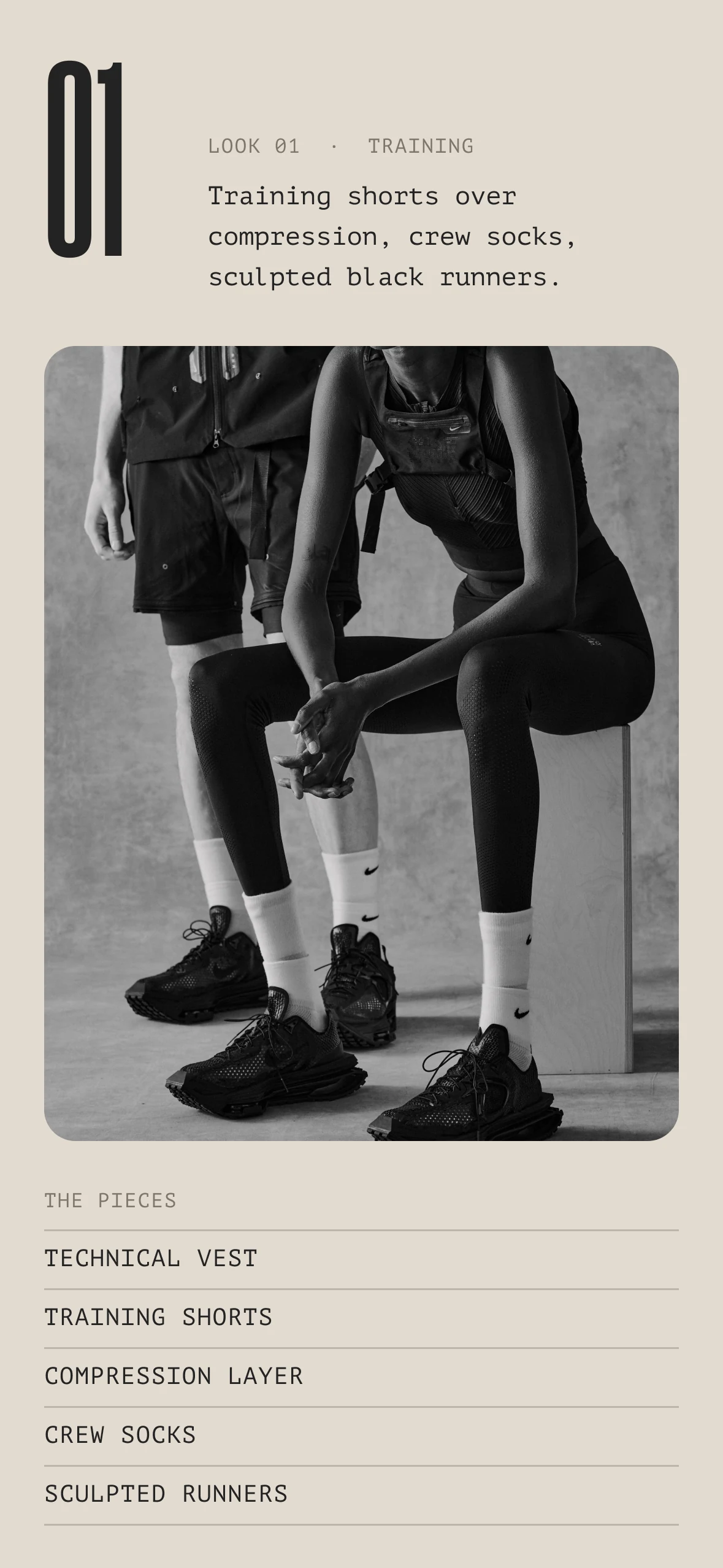
Phone, the Summer Lookbook’s first look: a large 01 with its label and caption beside it, a black-and-white photograph and the list of pieces
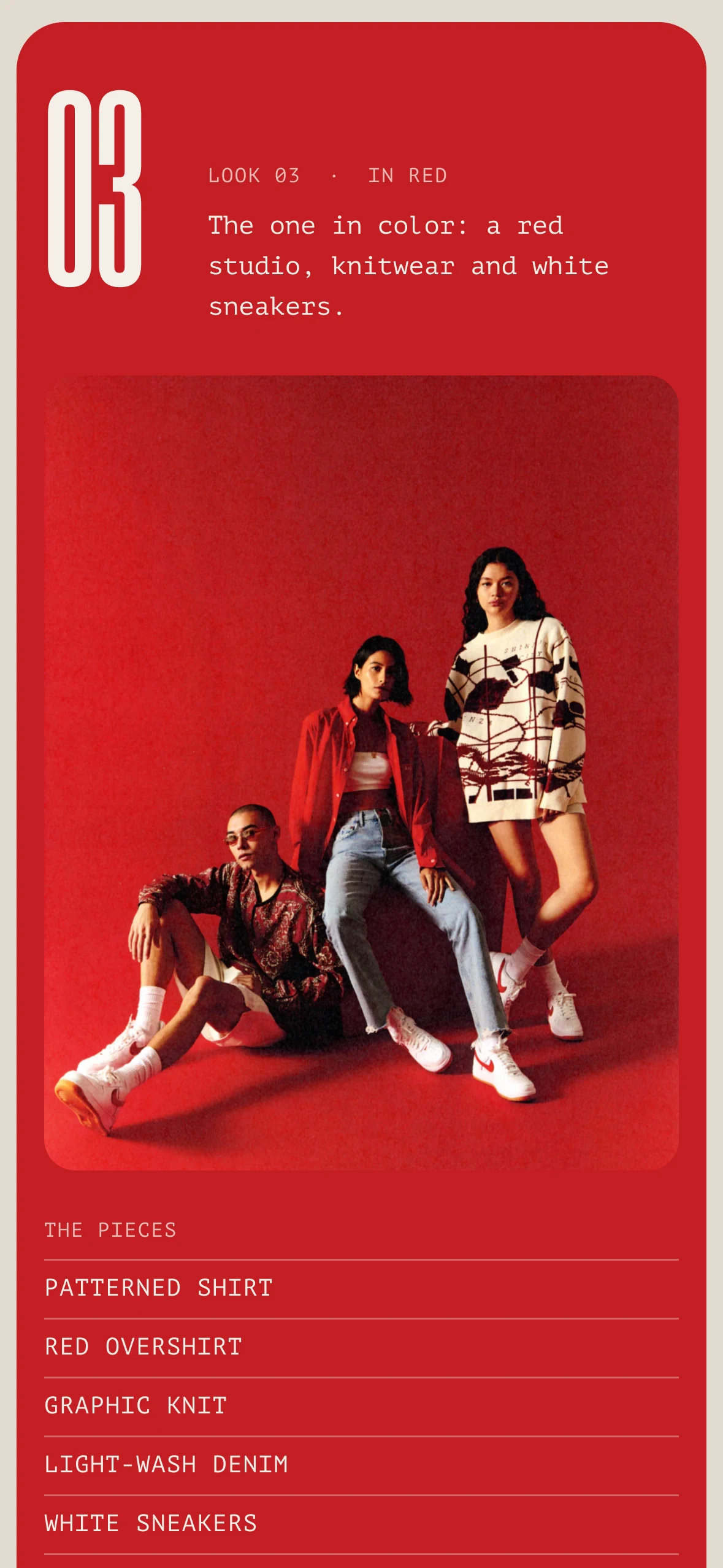
Phone, the lookbook’s third look on a red panel: a large 03 in cream with its caption beside it, the photograph on the red set and the pieces

The Lookbook on the phone: one screen per look, and Look 03 keeps its red band.

Every post gets one color card, its color taken from its own shoot. The card is the same in every post; only the color, the photograph and the numeral change.
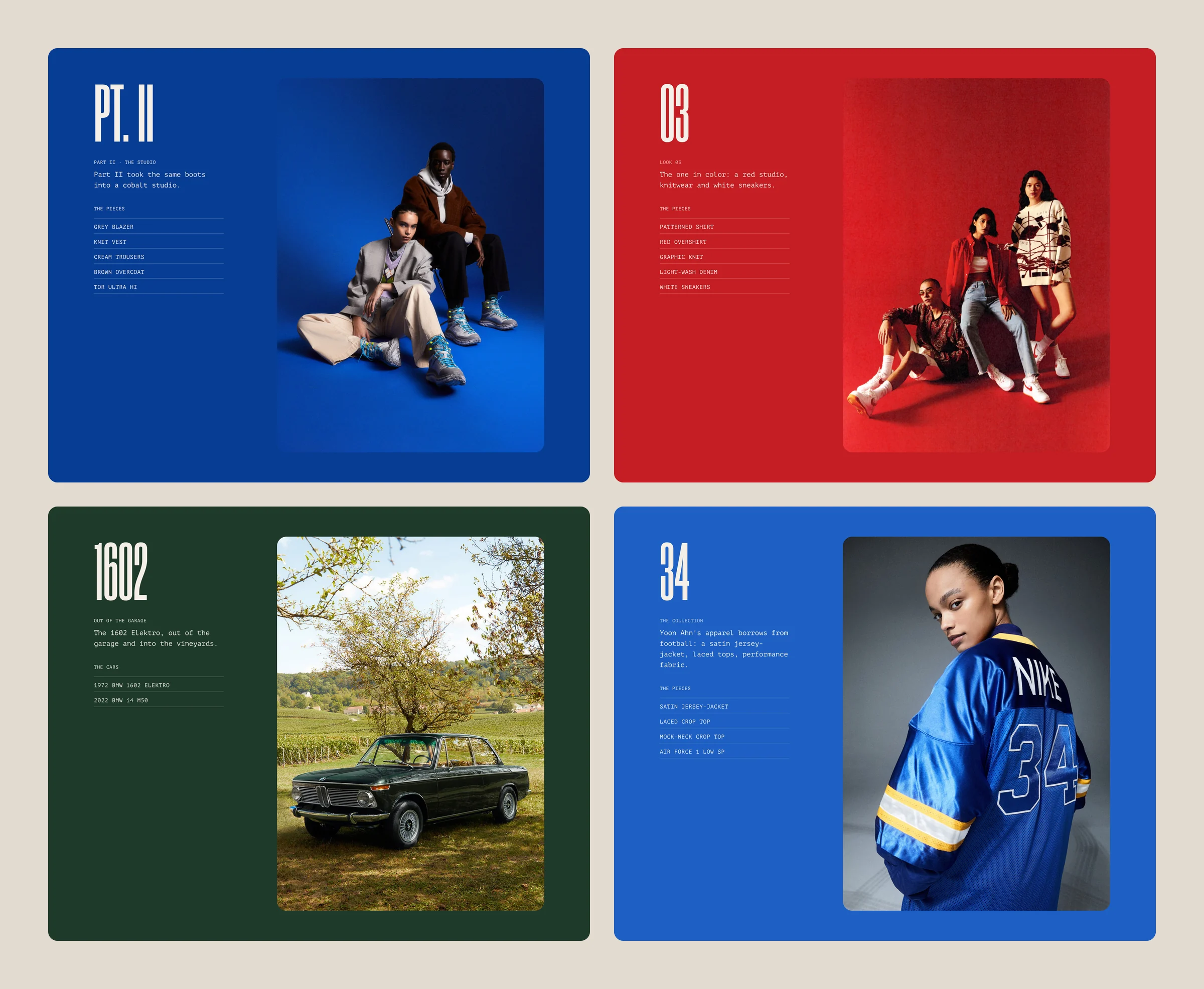
Four color cards on the page color, each with a large numeral, a short caption, a ruled list and a photograph: PT. II on cobalt with two models in the blue studio; 03 on red with three models on the red set; 1602 on racing green with the BMW 1602 Elektro under a tree; and 34 on royal blue with a model in the NIKE 34 satin jersey
PT. II on the Outdoor studio’s cobalt, 03 on the Lookbook’s red set, 1602 on the BMW’s racing green and 34 on the AMBUSH jersey’s royal blue.

The headline keeps time.

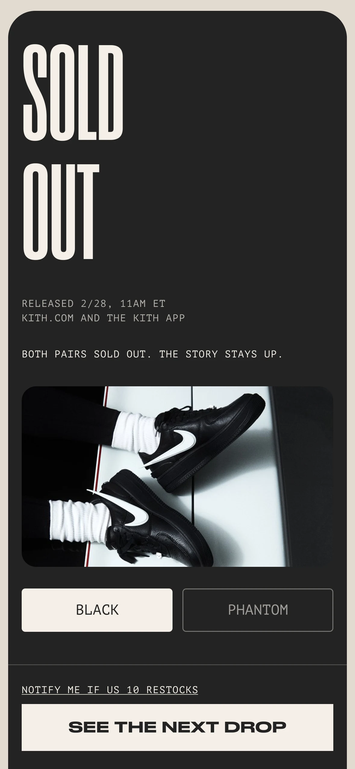
On drop day the page answers one question: can I buy it now? So the largest type answers it, and the panel’s color does too. The same headline reads AVAILABLE 2/28, 11AM ET on paper before the drop, AVAILABLE NOW on studio red when it opens, and SOLD OUT on ink when both pairs are gone. Kith’s own posts carry the release state in a line of small type. Here you can read it across the room.

Sizes open before the drop. Pick yours and the button waits, reading OPENS AT 11AM · US 10. At 11AM it becomes ADD TO BAG · US 10, so the drop itself is one tap. Anyone who isn’t ready can ask for one text at 10:55, for their size.
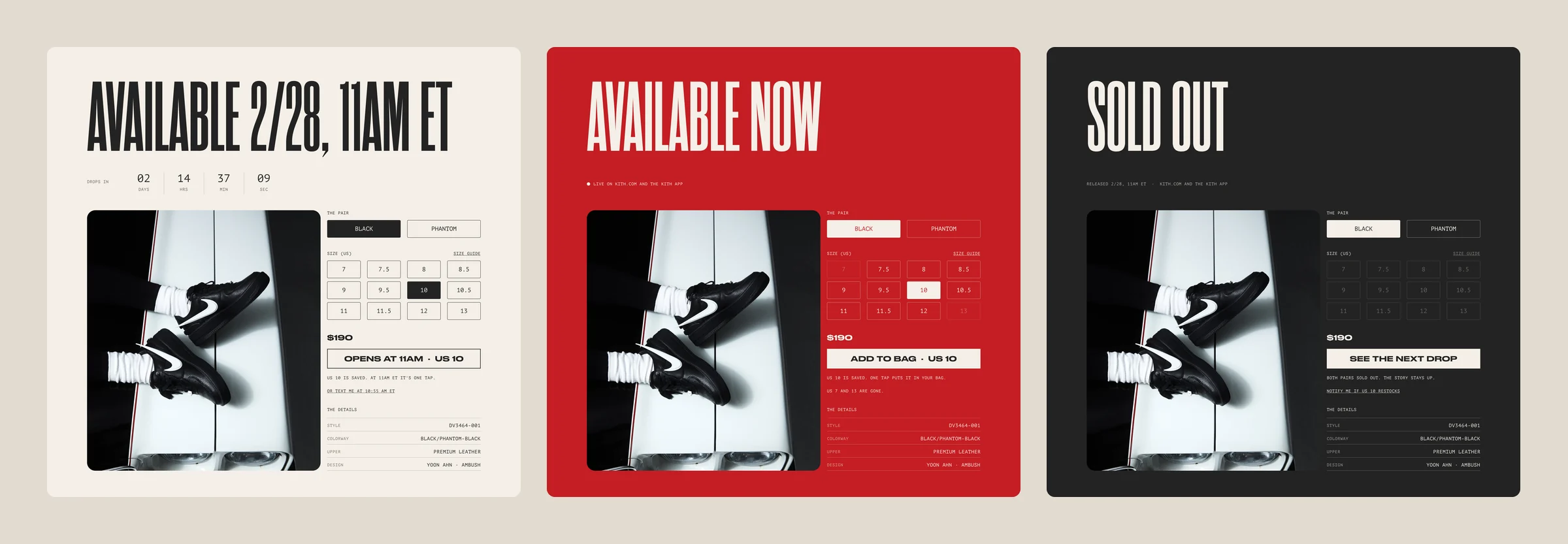
The drop panel in three states, side by side. Before, on paper: AVAILABLE 2/28, 11AM ET, a countdown, the Black selected, US 10 picked and an outlined button reading OPENS AT 11AM · US 10. Live, on studio red: AVAILABLE NOW, live on Kith.com and the Kith app, US 7 and 13 gone and ADD TO BAG · US 10. Sold out, on ink: SOLD OUT, every size dimmed and SEE THE NEXT DROP
Before, live and sold out: the headline, the color, the sizes and the button change together.

Tradeoff: picking a size early doesn’t hold a pair. It takes the size decision out of the rush, and the shoe still goes to whoever checks out first.

Two pairs, one page.

The Black and the Phantom dropped together and share one story, so they share one post. The pair switch sits above the sizes. It changes the photograph, the colorway and the style code without moving the page, and the size you picked comes with you.
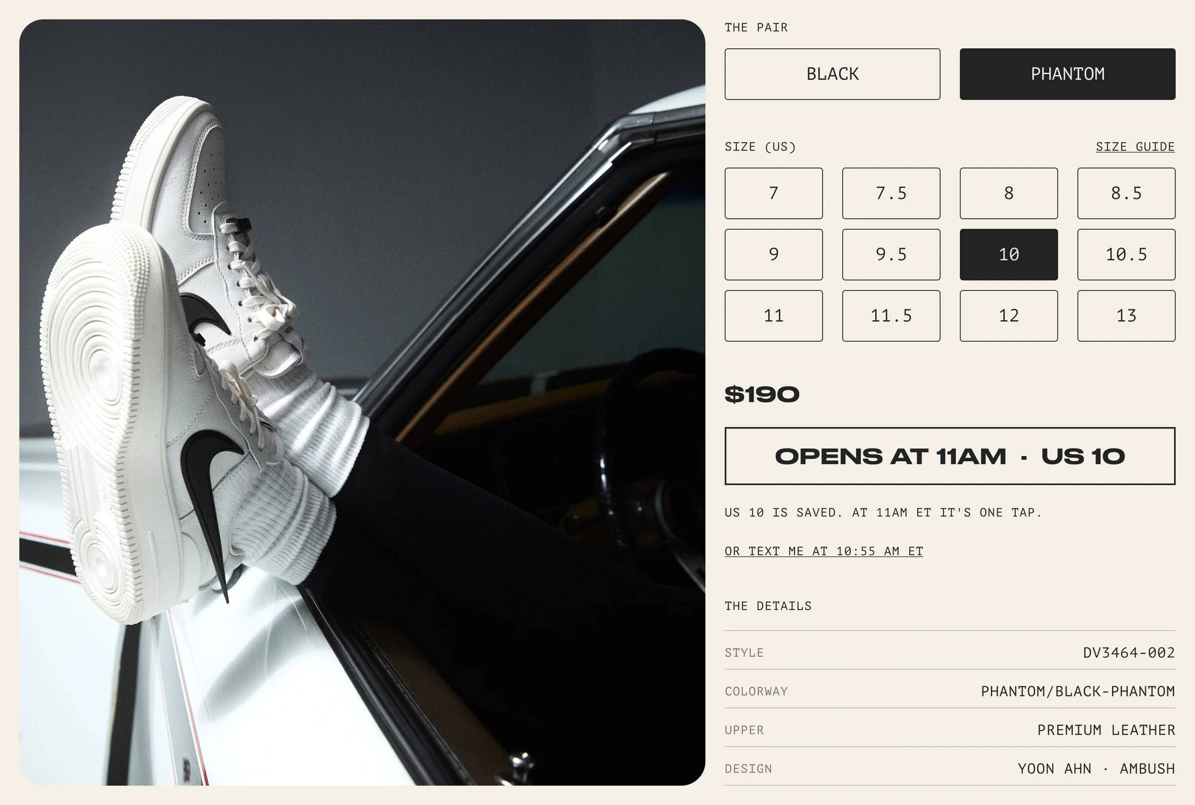
Inside the drop panel with the Phantom selected: the white Air Force 1 resting on a car door, and beside it THE PAIR with BLACK and PHANTOM, PHANTOM filled, the size grid with 10 picked, $190, OPENS AT 11AM · US 10, the note US 10 is saved, and the details: style DV3464-002, colorway Phantom/Black-Phantom, premium leather, design Yoon Ahn · AMBUSH
Switched to the Phantom: the photograph and the details change, US 10 and the button stay.

After the tap, the bag says plainly that it isn’t a hold, and offers the other pair in the same size.
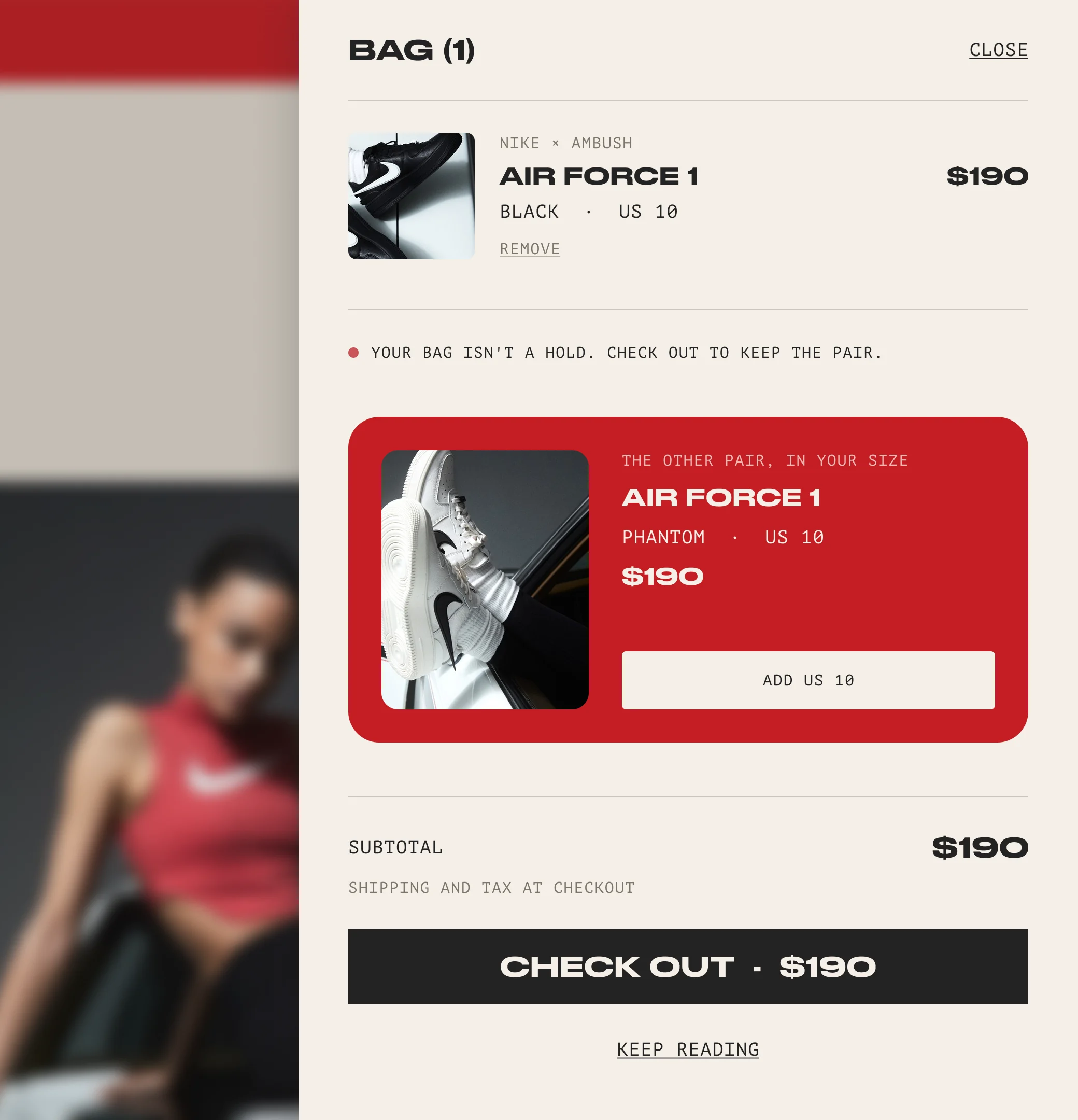
The bag drawer over the live page: BAG (1) with the Air Force 1 in black, US 10, $190, the note Your bag isn’t a hold, check out to keep the pair, a red card offering the other pair in your size, the Phantom in US 10 with an Add US 10 button, the subtotal and CHECK OUT · $190
The bag drawer: honest about holds, with the Phantom one tap away in US 10.

Sold out is a page, not an error.

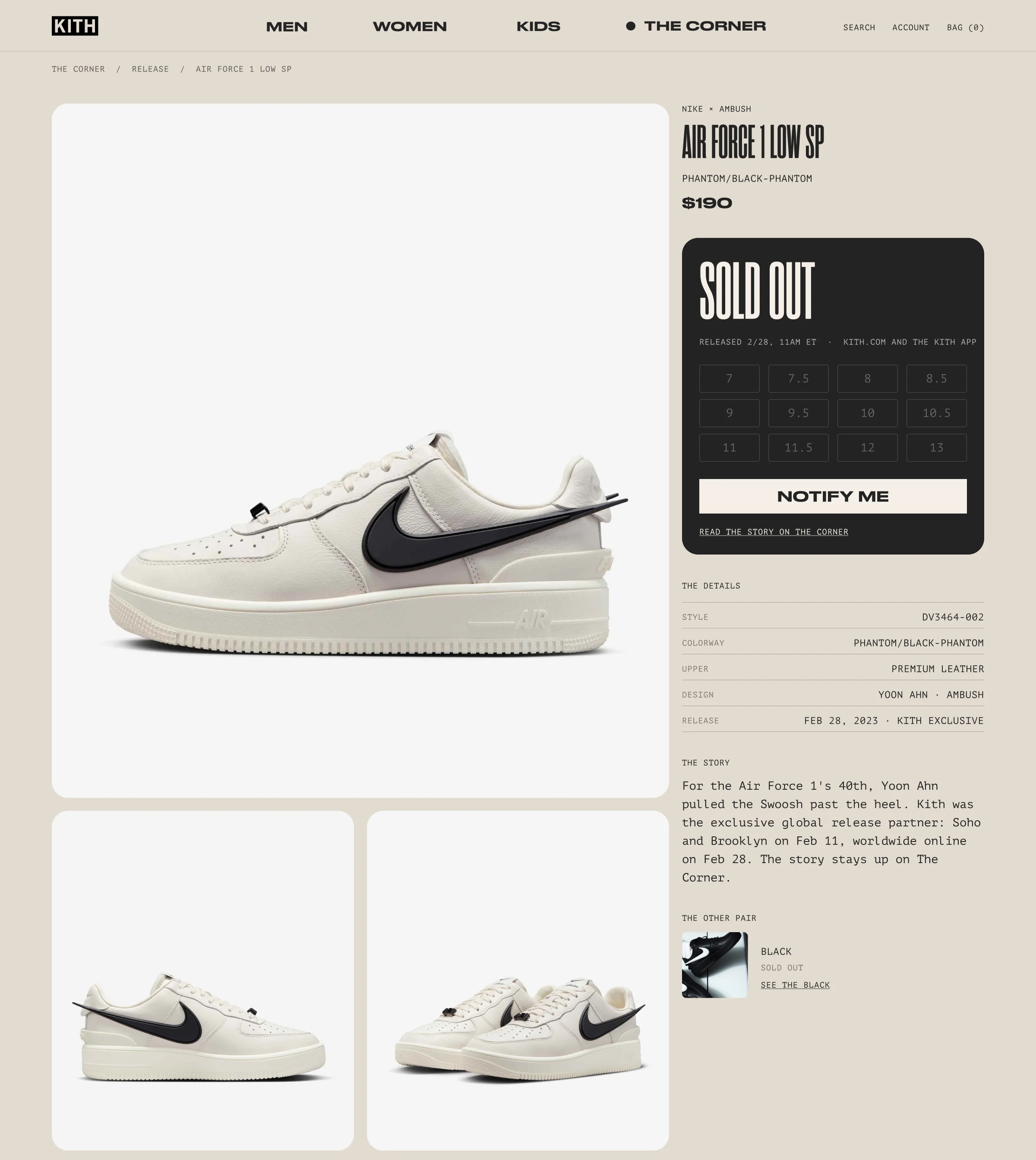
Kith’s own post for this release still says the online release “will be on February 28th”, and its SHOP NOW opens a page of other Nike sneakers. Here the post keeps the story, the button turns to the next drop, and your size can still ask for a restock alert. The product page does the same and points back to The Corner.
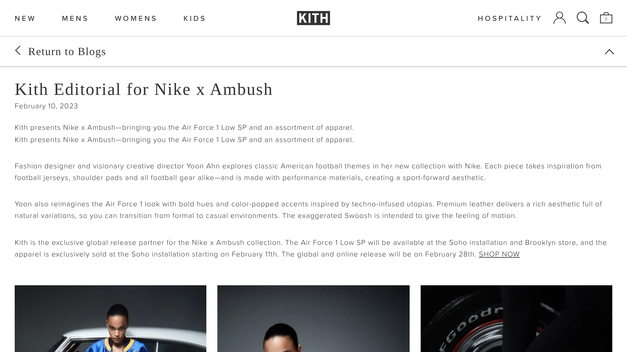
Kith.com’s post Kith Editorial for Nike x Ambush, dated February 10, 2023, as it read in October 2026: a small serif title, four paragraphs in small type, the last ending The global and online release will be on February 28th. SHOP NOW, and the top of the photo grid
Kith’s post for the same release, in October 2026: the drop is one line at the end of a paragraph.
The product page for the Nike × AMBUSH Air Force 1 Low SP in Phantom after the drop: a gallery of the shoe on the left, and on the right the name, colorway and $190, an ink card reading SOLD OUT with the release line, dimmed sizes, NOTIFY ME and a link to read the story on The Corner, then the details, the story and the other pair
The Phantom’s product page after the drop, with the gallery and the story still up.

Same drop, one hand.

On the phone the drop lives in a dock at the bottom of the screen, in reach of a thumb.

In motion · the drop

The pair and the size open in a sheet. Then the dock settles into the card: paper with the clock, studio red at 11AM, ink when both pairs are gone.
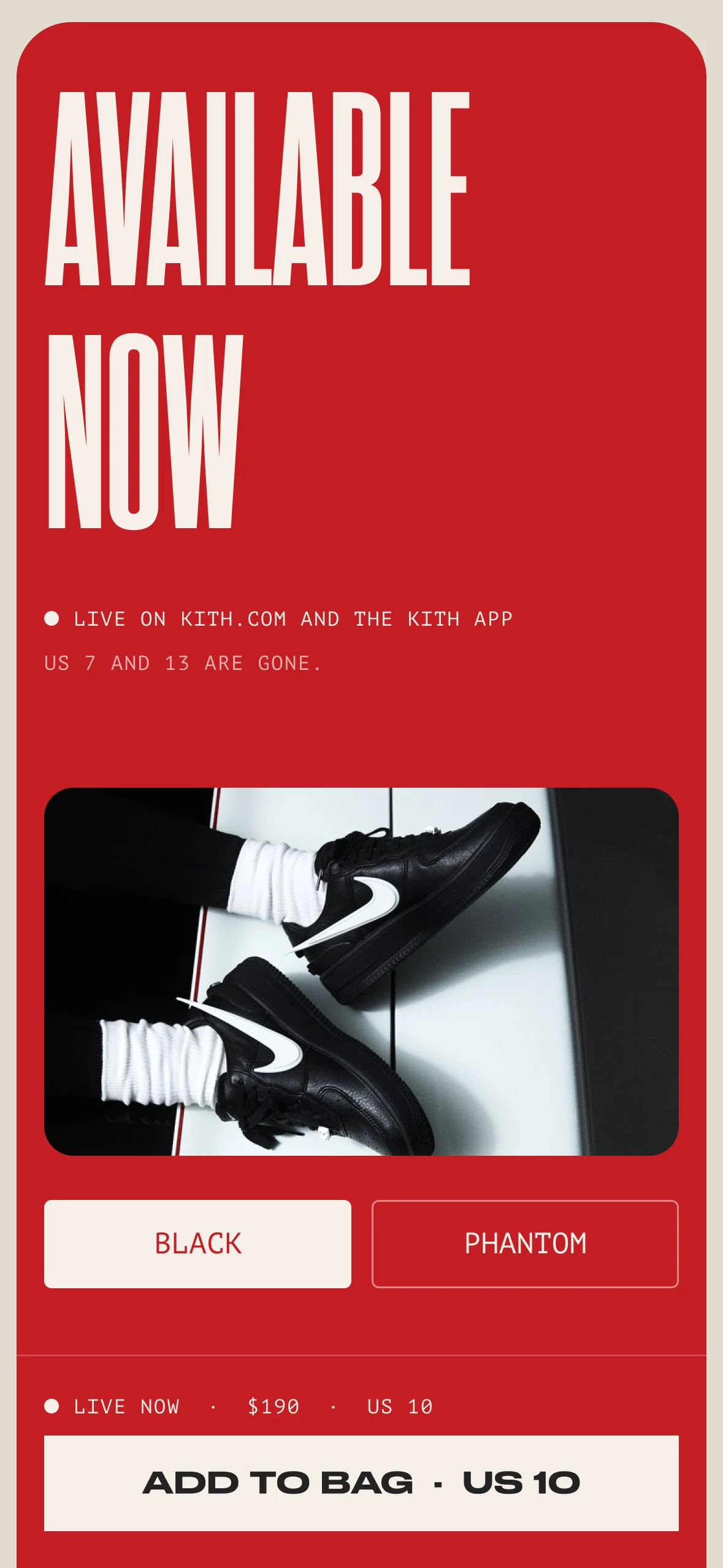
Phone, live: the card turns studio red with AVAILABLE NOW, live on Kith.com and the Kith app, US 7 and 13 gone, and the dock’s button reading ADD TO BAG · US 10
Phone, sold out: the card turns ink with SOLD OUT, the line Both pairs sold out, the story stays up, a link to be notified if US 10 restocks, and SEE THE NEXT DROP in the dock

Live, then sold out, with the next drop in the dock.

The system

Release information hierarchy.
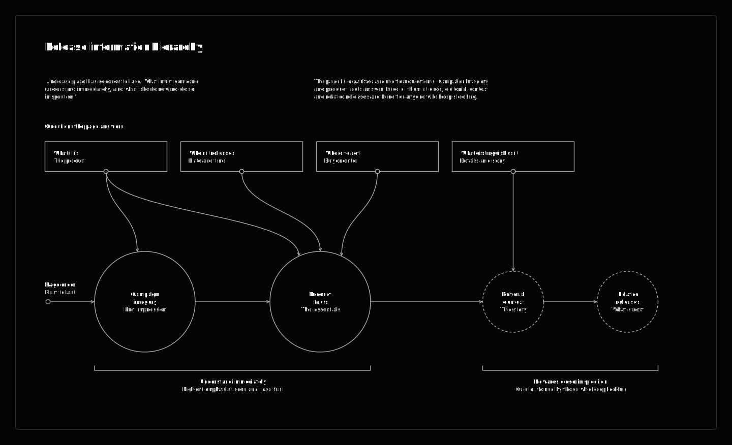
Nike × Kith — release information hierarchy
What a release page must make understood immediately and what can reward closer inspection: the four questions, the content that answers each, and the two tiers of emphasis. A model of the designed release page.

The craft is in the states.

A release page is a sequence of states, not a single screen. The work was carrying the art direction through all of them, so the date, the drop, the bag and the sellout all look like Kith, and the story is still there when the stock isn’t.

Three numbers would show whether it works: how many people pick a size before 11AM, how many check out in the first minute, and how many still read the story after both pairs are gone.