Four brands shouldn’t mean four ways to shop.
Intro
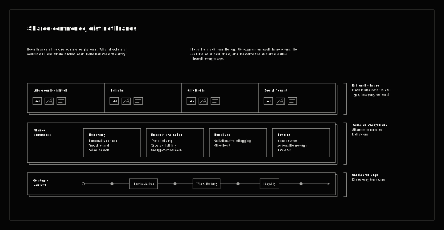
Abercrombie & Fitch, Hollister, Gilly Hicks, and Social Tourist serve different audiences through distinct brand identities. The shopping experience still needs a coherent logic: find a product, understand its fit, share a selection, complete a purchase, and handle what comes afterward. The challenge was giving those tasks a shared structure without flattening the brands.
I owned the UX design of the mobile shopping experiences shown here, from journey architecture through interaction and interface design. The work establishes what stays consistent as the brand changes, the shopping task changes, or another person takes responsibility for completing the purchase.
The flows span visual search, styling and fit, matching sets, shared shopping and purchase approval, store context, and order updates and returns.
Role / Scope
One structure. Four identities.
Recurring navigation and shopping controls establish the common structure: Today, Shop, Profile and the bag sit in the same positions on all four. Typography, color, photography and editorial composition carry the differences. Consistency is a constraint on behavior, not a requirement that every screen look alike.
Scroll to explore. Select a screen to inspect.
Let behavior stay familiar while the brand changes.
The comparison across the four designs makes the boundary visible. The system supplies the framework; each brand controls how it introduces its world and its products. Selecting a product, inspecting it, or moving toward the bag has a recognizable logic even when the surrounding presentation changes.
From inspiration to a product.
Visual search starts with an image rather than a product name. I kept that source available as matches appear in a partial-height sheet and expand for closer inspection, so the customer can refer back to what caught their attention while examining the results.
Scroll to explore. Select a screen to inspect.
Keep styling, fit and purchase connected.
Product evaluation brings several questions together: the garment, its fit, how it works with other pieces, and whether to add it to the bag. I placed sizing guidance, styling and product information close to that decision, and the add-to-bag confirmation offers both a route to checkout and a way to keep building the outfit.
Scroll to explore. Select a screen to inspect.
Shop the set without losing the details.
The current selection stays clear while supporting information and related products remain around it. The matching piece is within reach while the shopper checks sizing, reviews and care, and the bag carries the applied offer into a checkout where delivery and store pickup stay explicit choices.
Scroll to explore. Select a screen to inspect.
Make a shortlist easy to share.
Browsing history addresses a different part of discovery: returning to something already considered. In the Hollister sequence, previous exploration becomes a shortlist. Customers select items and share them through the phone’s own messaging tools, carrying actual products into the conversation.
Scroll to explore. Select a screen to inspect.
Return to a decision with fit guidance.
Previously viewed products stay available on return, and try-on, sizing guidance and customer reviews sit inside the product decision. When someone else will pay, the bag includes an explicit purchase-permission step.
Scroll to explore. Select a screen to inspect.
Carry the bag into purchase approval.
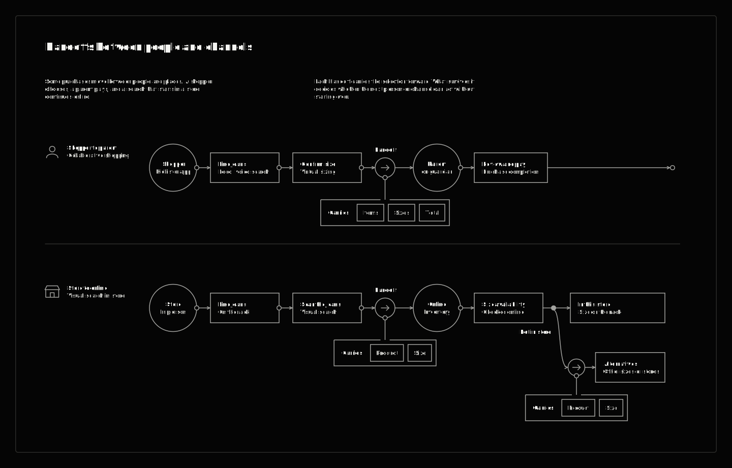
Purchase approval carries context into another person’s decision. The shopper sends the bag; the recipient reviews the requested products and approves the remaining selection. The items and their purchase context stay explicit through the handoff.
Scroll to explore. Select a screen to inspect.
Give the store visit a next step.
The store sequence handles a different interruption. When a scanned size is unavailable, nearby stock and delivery become the next choices. The product remains the subject of the decision while the route to obtaining it changes.
Scroll to explore. Select a screen to inspect.
Carry the selection when responsibility changes.
I treated these as distinct journeys with a shared requirement: preserve the selection and make the next responsibility clear. One moves between people; the other moves between fulfillment options.
Connect order updates to the next visit.
Order updates appear within the Today feed, connecting purchase information to a familiar part of the experience. The information changes after checkout, but the need for a clear next action remains.
Scroll to explore. Select a screen to inspect.
Make preferences part of discovery.
Gilly Hicks carries its visual identity from onboarding into the shopping feed. Lightweight preference questions sit beside editorial content, while the product page keeps a coordinating piece within reach.
Scroll to explore. Select a screen to inspect.
Keep returns connected to the order.
Returns begin with the recent purchase and give item selection and return method their own steps. Receiving an order, reviewing it and returning an item belong to the same shopping relationship as discovery and purchase.
Scroll to explore. Select a screen to inspect.
One model, with room for four identities.
The work demonstrates the value of defining shared behavior at the scale of the whole experience. It makes room for four distinct identities and a substantial range of tasks, while preserving the context people need as their decisions change.
Standardize behavior, not identity.
The strongest system decision was separating what customers need to learn from what each brand needs to express. When those layers have clear responsibilities, consistency can support distinction instead of erasing it.